

Skip the intro · jump to the list ↓
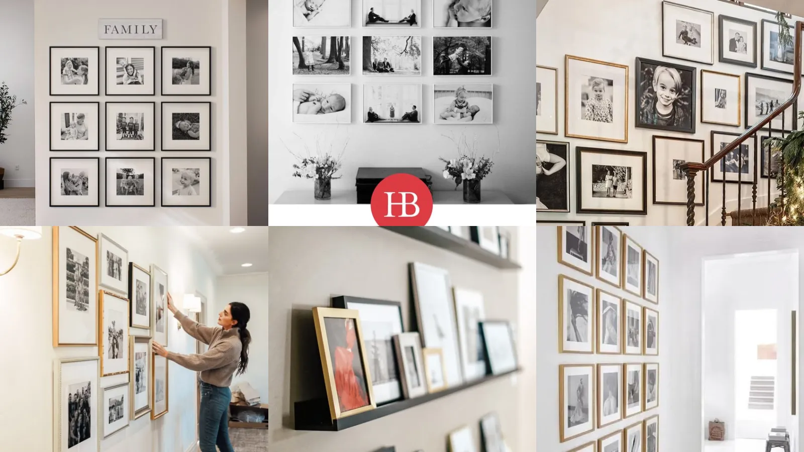
This list is for anyone staring at a blank wall with a stack of framed photos and zero idea where to start. Beginners, renters, busy people, last-minute planners, you’re all covered here!
Nobody wants to spend a whole weekend measuring and re-hammering nail holes. So these ideas lean toward the ones that actually work in real homes, not just in a perfectly staged studio shot.
I scrolled through what felt like hundreds of pins to pull these together. The winners were the layouts that looked good but didn’t require an engineering degree to hang, lol!
Every idea below is organized by the space it fits best. Some are made for a big blank wall, some are built for a staircase. A few are perfect for a narrow hallway that never gets any love.
Under each one you’ll find the small details that actually matter, like frame count or spacing tricks. There’s also a link if you want the full step-by-step for that exact look.
Grab a tape measure and maybe a friend to hold frames up while you squint from across the room. Let’s get into it!
FAMILY PHOTO WALL LAYOUT IDEAS
Symmetrical Grid Family Wall
We’re starting off strong with the classic symmetrical grid. Rows and columns, all the same size, all lined up like they mean business.
This layout works because your brain loves order. It’s the safest choice if you’re nervous about commitment. Honestly there’s no shame in that.
- The no-fail starter wall
- Even spacing does the heavy lifting
- Works with any frame brand
Salon Style Photo Wall Layout
How cute is the salon style layout when it’s done right? Frames of all shapes climb up the wall in a loose, happy cluster.
There’s no strict rule here, which honestly makes it more fun. Cut paper templates first and tape them up before a single nail goes in the wall.
- Controlled chaos, basically
- Paper templates save your walls
- Mixes vertical and horizontal easily
Mixed Frame Sizes Layout
Mixing frame sizes keeps a wall from feeling flat. A big statement frame anchors the group while smaller ones fill in the gaps around it.
This one plays nicely with mismatched frames you already own. Thrift store finds work just as well as anything bought new. The differences add character instead of chaos.
- Big frame does the anchoring
- Thrift store frames blend right in
- No two sizes need to match
Family Tree Photo Arrangement
A family tree arrangement tells a story instead of just showing pictures. Branches painted or taped onto the wall connect the photos in a way that actually means something.
It works especially well for multi-generation displays. Grandparents at the top, cousins scattered along the bottom, everyone gets a spot.
- The one with actual meaning
- Washi tape branches peel off clean
- Fits generations of photos easily
Black And White Photo Wall
Black and white photos have a way of making any wall look instantly put together. Nothing clashes because there’s no color to clash with.
This is the layout to try if your photos span different decades and different lighting. Converting everything to black and white smooths all of that right out.
- Zero color coordination needed
- Any editing app converts photos free
- Hides mismatched lighting instantly
Circular Photo Wall Layout
Who says photo walls need to be square and boring? A circular layout curves frames around a center point for something a little different.
This works great above a couch or a console table. Keep the center empty or add one bigger frame right in the middle for balance.
- The curveball layout, literally
- Great above a couch or console
- One center frame anchors the ring
Rustic Wood Frame Layout
Rustic wood frames bring warmth that white or black frames just can’t match. Pair them with a simple grid or a loose cluster and the wood does the rest.
Reclaimed wood frames look especially good against a lighter wall color. Talk about a cozy focal point for a living room or reading nook!
- Warm wood over cold metal
- Reclaimed wood frames add texture
- Pairs well with lighter wall paint
Ascending Staircase Photo Line
Staircase photo wall ideas usually start right here, with a simple ascending line. Frames follow the slope of the stairs in one continuous row.
Measuring the angle first saves a ton of frustration. Keep the same gap between each frame as you climb and the whole thing reads as intentional instead of crooked.
- Follows the slope, no guessing
- Measure the stair angle first
- Even gaps read as intentional
Staircase Wall With Floating Shelves
Floating shelves along a staircase wall solve a problem frames alone can’t. You can swap photos in and out without adding new nail holes every time.
This is great for renters who can’t drill a dozen holes into a stairwell. Lean the frames instead of hanging them and rearrange whenever the mood strikes.
- Rearrange without new holes
- Renter friendly install
- Leaned frames swap out fast
Diagonal Frames Along Staircase
Diagonal frames add movement to a stairwell that a straight line just doesn’t. Instead of following the stairs exactly, the frames zigzag slightly off the slope.
It takes a little more planning with a level and some patience. The payoff is a staircase wall that feels more like art than paperwork.
- A little zigzag, a lot of drama
- A level is non-negotiable here
- Slight offsets add visual movement
Narrow Hallway Photo Cluster
Hallway family gallery ideas often start with a tight little cluster near a doorway. Narrow hallways don’t leave much room to spread frames out, so grouping them close makes sense.
Keep the cluster at eye level so it doesn’t get missed on the way past. This spot is perfect for a rotating set of favorite shots.
- Built for tight spaces
- Eye level keeps it noticed
- Great for rotating favorites
Hallway Gallery With Sconces
Sconces mixed into a hallway gallery add a soft glow that regular overhead lighting just can’t compete with. Frames get to actually be seen instead of guessed at in a dim hallway.
This layout works especially well in older homes with existing wall wiring. It instantly makes a plain hallway feel like a proper gallery.
- Lighting that actually flatters
- Works with existing wall wiring
- Turns a hallway into a gallery
Long Hallway Timeline Display
A long hallway timeline display lines photos up in chronological order down the wall. Walking the hallway becomes a little walk through the years.
It works best in a hallway with consistent light. Add small labels or dates underneath if you want it to feel extra intentional.
- A walk through the years
- Small date labels add polish
- Best in consistent hallway light
Layered Photo Ledge Display
Layered ledges let frames overlap in front of each other instead of lining up flat. It creates depth that a flat grid just can’t give you.
This is forgiving for anyone who hates commitment, lol! Slide frames around anytime without a single new hole in the wall.
- Depth without extra nail holes
- Rearrange in under a minute
Floating Ledge Family Portraits
Photo ledge ideas family style usually mean one thing: simple floating shelves loaded with portraits. It’s the easiest way to display a rotating cast of photos without measuring a thing.
Group frames by size on each shelf for a cleaner look. Mismatched frames still work great here since the shelf itself pulls everything together.
- No measuring, no stress
Photo Ledge With Greenery
A little greenery tucked between frames on a ledge softens the whole display. Even a small faux plant makes the wall feel less like a museum and more like a home.
- Faux plants need zero watering
- One small pot softens the whole shelf
Perfect Square Grid Wall
Grid gallery wall ideas don’t get more satisfying than a perfect square. Same frame, same size, same spacing, arranged in a tidy square block.
This layout is basically foolproof if you use a template and a laser level. It looks sharp above a desk or a bed headboard.
- Foolproof with a laser level
- Looks sharp above a headboard
Color Coordinated Grid Gallery
Color coordinated grids pick one color story and stick to it. Think warm neutrals only, or every photo edited with the same filter.
It reads as polished without needing matching frames at all. This is the pick for anyone who wants their wall to look like it belongs in a catalog.
- One color story, zero clutter
- Same filter ties photos together
Minimalist White Frame Grid
Last but definitely not least, we have the minimalist white frame grid. Clean lines, matching white frames, plenty of breathing room between each one.
This layout suits a modern space that already has a lot going on visually. It calms a room down instead of adding to the noise. Honestly, that’s exactly what a lot of walls need.
- Calm on purpose
- Extra spacing adds breathing room
Just a little note - some of the links on here may be affiliate links, which means I might earn a small commission if you decide to shop through them (at no extra cost to you!). I only post content which I'm truly enthusiastic about and would suggest to others.
And as you know, I seriously love seeing your takes on the looks and ideas on here - that means the world to me! If you recreate something, please share it here in the comments or feel free to send me a pic. I'm always excited to meet y'all! ✨🤍
Xoxo Lara